
Rounded Corners
Rounded corners used to be the stuff of constricting solid background images or, for flexible boxes, numerous background images, one per-corner, slapped on multiple nested div elements. Argh, ugly. Well, not any longer. Now, with simple CSS, you can lavish your designs with more curves than Marilyn Monroe.
Border radius?
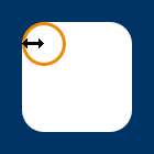
Yeah. Border radius. Fear not, though — you don’t have to have borders. The border-radius property can be used to add a corner to each corner of a box.
#marilyn {
    background: #fff;
    width: 100px;
    height: 100px;
    border-radius: 20px;
}
And there you have it. Rounded corners, see? Well, you will if you’ve got a sensible browser (see note below).
Of course, if you do want a border…
#ok_a_border_then {
    border: 5px solid #8b2;
    width: 100px;
    height: 100px;
    border-radius: 5px;
}
Woop.
Multiple values
border-top-left-radius, border-top-right-radius, border-bottom-right-radius, and border-bottom-left-radius can also be used to target specific corners.
Ever so slightly less horribly wordy, you can also define all corner radii (what a great word) individually with a space-separated list of values, working clockwise from top-left, just like other shorthand properties:
#monroe {
    background: #fff;
    width: 100px;
    height: 100px;
    border-radius: 6px 12px 18px 24px;
}

Curvy.
By using two values instead of four you target top-left and bottom-right with the first length (or percentage) and top-right + bottom-left with the second. Three values? Top-left, then top-right + bottom-left, then bottom-right. Smashing.
Ellipses
Are circles a bit too square for you? You can specify different horizontal and vertical radiiii by splitting values with a “/”.
#nanoo {
        background: #fff;
        width: 100px;
        height: 150px;
        border-radius: 50px/100px;
        border-bottom-left-radius: 50px;
        border-bottom-right-radius: 50px;
}