
CSS Dropdowns
A not-uncommon flavor of navigation is the dropdown menu, where sub-navigation lists only appear when the cursor passes over a link.
HTML Dog has a long history with dropdowns — we highlighted the popular Suckerfish Dropdowns method back in 2003. Standards and browsers have come a long way since then, though, and now we can safely use a much simpler technique, using CSS without the need for any JavaScript.
The HTML: Nicely nested lists
Like all good navigation, lists of links are the best option to structure dropdowns. As we want one item to reveal a group of sub-items, we most certainly want nested lists — that is, a list of lists:
<ul>
    <li>
        <a href="">Birds</a>
        <ul>
            <li><a href="">Ratites</a></li>
            <li><a href="">Fowl</a></li>
            <li><a href="">Neoaves</a></li>
        </ul>
    </li>
    <li>
        <a href="">Mammals</a>
        <ul>
            <li><a href="">Monotremes</a></li>
            <li><a href="">Marsupials</a></li>
            <li><a href="">Placentals</a></li>
        </ul>
    </li>
    <!-- etc. -->
</ul>
So we have “Birds” and “Mammals” as our top-level items, and “Ratites”, “Monotremes”, and so on, as our second-level, sub-category, items.
CSS: The bare necessities
To set it all up visually, let’s zero the default padding (and margin, for older browsers) of the lists:
ul {
    padding: 0;
    margin: 0;
}
Next, for each list item, we want to lay them out horizontally. Thinking ahead, we also want to specify that the origin for positioning all sub-lists is from their parent list item:
li {
    display: inline;
    position: relative;
}
Now, let’s tackle the lists within the list. We want to position them absolutely, placing them over everything, and we want to hide them:
ul ul {
    position: absolute;
    display: none;
}
Finally, to reveal those sub-lists when a primary list item is hovered over:
li:hover ul {
    display: block;
}
The first accompanying example shows this in action, along with explanatory inline comments (view the source).
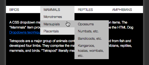
Multi-level dropdowns
Accommodating more than one level of dropdown menu would involve more list nesting:
<li>
    <a href="">Mammals</a>
    <ul>
        <li>
            <a href="">Monotremes</a>
            <ul>
                <li><a href="">Echidnas</a></li>
                <li><a href="">Platypus</a></li>
            </ul>
        </li>
        <li>
            <a href="">Marsupials</a>
            <ul>
                <li><a href="">Opossums</a></li>
                <li><a href="">Numbats, etc.</a></li>
                <li><a href="">Bandicoots, etc.</a></li>
                <li><a href="">Kangaroos, koalas, wombats, etc.</a></li>
            </ul>
        </li>
        <li>
            <a href="">Placentals</a>
            <ul>
                <li><a href="">Primates, ungulates, etc.</a></li>
                <li><a href="">Anteaters, sloths, etc.</a></li>
                <li><a href="">Elephants, etc.</a></li>
            </ul>
        </li>
    </ul>
</li>
Now, to treat these new sub-sub-lists slightly differently, we want them to appear to the side of their parent list items, rather than underneath them:
ul ul ul {
    left: 100%;
    top: 0;
}
A slight amendment is needed, too. As it stands, all descendant lists of a hovered-over list item would be revealed. So when “Mammals” is hovered over in this example, not only would “Monotremes”, “Marsupials”, and “Placentals” be shown, so would all of the types of marsupial — “Oppossums”, and so on. We only want the first descendent — the children (not grandchildren) — to be shown. So we amend li:hover ul by popping in a child selector:
li:hover > ul {
    display: block;
}
Pretty pretty
The third accompanying example pretties things up a little. The presentation choices are yours, of course, but this gives some things to think about. Highlighting parent lists is always a good way to offer an extra cue as to where you are. Transitions offer an added benefit of keeping the dropdowns around that little bit longer, reducing the problem of lists infuriatingly disappearing when the cursor momentarily strays outside of the boundaries of the dropdown.