
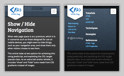
Show / Hide Navigation
When web page space is at a premium, which it is in scenarios such as those designed for use on mobile devices, you might want to hide things, such as your navigation area, and show them only when visitors choose to see them.
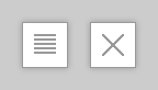
This article looks at two options for achieving this: using JavaScript, and exploiting the CSS :target pseudo class. As an extra bell and/or whistle, it includes “show” and “hide” icons made from CSS gradients instead of images.
These techniques demonstrate a simple and effective way to increase the usability of a page and they manipulate accessibility considerations that are useful to have regardless of the show / hide quest.
The Markup
We’re going to start with a typical page structure:
<body id="body">

<p><a href="#main_nav" id="access_nav" class="access_aid">Skip to navigation</a></p>

<article>
    <!-- main content here -->
</article>

<nav id="main_nav">
    <ul>
        <li><a href="">This</a></li>
        <li><a href="">That</a></li>
        <li><a href="">The other</a></li>
        <!-- etc. -->
    </ul>
    <p><a href="#body" id="access_top" class="access_aid">Skip to top</a></p>
</nav>

</body>
Note that we have the accessibility considerations of a “Skip to navigation” link and a “Skip to top” link. These are beneficial for those using non-visual browsers (such as screen readers) or those who are unable to use a pointing device (and may be using a keyboard-like tabbing system, for example). These links will, however, prove additionally useful in our show / hide technique.
Showing and Hiding
Cutting to the chase and keeping it simple for the time being, we’re going to have our page start out with a visible content area and hidden navigation. So we can start with this CSS:
#main_nav {
    display: none;
}
In all likelihood you probably won’t actually want your main web site to start out like this — you would usually want the navigation to be available for all to see. You can target this hidden navigation specifically in instances of smaller screens, though, using media queries. In this way, such an approach comes into play nicely when adapting a design for mobile devices.
JavaScript
The most obvious way to switch the display of the navigation on and off is to use JavaScript. The following example can be used as one way to add and remove a class attribute (in this case “with_nav”) to the body when the “Skip to navigation” link is clicked:
var nav = document.getElementById('access_nav'),
    body = document.body;

nav.addEventListener('click', function(e) {
    body.className = body.className? '' : 'with_nav';
    e.preventDefault();
});
In short, this will:
- Wait for the element with ID “access_nav” to be clicked
- Add the class “with_nav” to the body (OR remove it, if it’s already there)
- Prevent the actual destination of the link from being followed
The page can then be styled appropriately, fundamentally including:
.with_nav #main_nav {
    display: block;
}
:target
Alternatively, we can avoid JavaScript all together. The :target pseudo class can be used to style a target element in a page, that is, an HTML element with an ID (such as “blancmange”) that is linked to (with something like “raspberry.html#blancmange”). In this case, our target element is that with the ID “main_nav” — our main navigation area. So when someone selects the “Skip to navigation” link, the page will jump to “main_nav” and we can then style that box differently:
#main_nav:target {
    display: block;
}
Now, not only will the page jump to the suddenly appearing navigation area when “Skip to navigation” is selected, when “Skip to top” Is subsequently selected, the navigation will disappear again. This is because “main_nav” would no longer be the target anchor.
Styling
There are plenty of things you can do with that basic concept, but let’s fix up an obvious issue: we don’t want the page to jump down, we want the navigation to majestically appear near to the instigating link. One obvious solution is to simply position the navigation at the top of the page:
#main_nav {
    display: none;
    position: absolute;
    top: 0;
    left: 0;
    background: #fff;
}
Buttons with gradients
We can pretty this up in plenty of ways — colors, whitespace, shadows, transitions, etc. — but there’s one last essential thing that isn’t quite right: the accessibility link “Skip to…” text doesn’t make much sense when referring to “show” and “hide”. We don’t want to change the text of the links because they’re well worded for their original accessibility purpose. But we can replace them with icons fitting to our task. So, just to be posh, we’ll finish off by styling our show / hide buttons with icons made from linear gradients instead of background images.
Let’s get some basics out of the way first, though. We can prepare our links to be more button-like and we can place them in better positions:
.access_aid {
    display: block;
    position: absolute;
    top: 0;
    right: 0;
    width: 40px;
    height: 0;
    padding-top: 40px;
    overflow: hidden;
    border: 1px solid #ccc;
}
This will push our link boxes to the top right of their respective parent boxes, turn them into squares, shove the text out of the way, and slap a thin border around them.
Now to create those icons. We’re going for a series of horizontal lines to represent “show” (this being a common convention in suggesting “navigation”) and a cross to represent “hide” (being an even more ubiquitous symbol for “close”):
.access_aid {
    /* In addition to the existing declarations... */
    background: white 10px 10px / 20px 20px no-repeat;
}

#access_nav {
    background-image: -webkit-repeating-linear-gradient(#ccc, #ccc 2px, #fff 2px, #fff 4px);
    background-image: repeating-linear-gradient(#ccc, #ccc 2px, #fff 2px, #fff 4px);
}

#access_top {
    background-image: linear-gradient(45deg, transparent 13px, #ccc 13px, #ccc 15px, transparent 0), linear-gradient(-45deg, white 13px, #ccc 13px, #ccc 15px, white 0);
}
To break this down, the code:
- Sets the background position to be a single instance, 10 pixels in from the left, 10 pixels down from the top, and to be 20 pixels by 20 pixels in size.
- Adds a repeating horizontal gray and white linear gradient for the “show” button.
- Adds two diagonal gradients for “hide”, one for each line that makes up the cross.
Bam. Easy.
Live!
Have a gander at the JavaScript example and the target example to see it all work together. There are a few additional licks of paint in there, but the purpose of these, as with all of the examples on this site, is to show a bare-bones proof of concept. Tinker.