Transformations
A woeful mega-budget Michael Bay movie about CSS?! Nay, the powerful manipulation of the shape, size, and position of a box and its contents using the transform property.
By default, CSS boxes, those visual representations of HTML elements, are so square. Rectangular, at least; level, with four straight sides and four boring right angles. But with the use of transform you can stretch and mold those boxes into all manner of shapes.
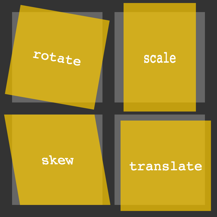
Manipulating a box over two dimensions, transform can be used to rotate, skew, scale and translate a box and its contents.

Rotating
The following would result in a square orange box with all of its contents — text, images, whatever — obediently standing to attention:
.note {
    width: 300px;
    height: 300px;
    background: hsl(36,100%,50%);
}
But you can spin those soldiers around by adding a further declaration:
transform: rotate(-10deg);
This will turn the box and, importantly, everything in it, ten degrees anti-clockwise.
Skewing
Skewing allows you to tip the horizontal and vertical so the following…
transform: skew(20deg,10deg);
…will tip over the x-axis by 20 degrees on the y-axis by 10 degrees.
You can also specify one angle, such as skew(20deg), which is the equivalent of skew(20deg,0).
Scaling
Obviously, you can change width and height properties on a box, but that won’t affect the size of anything inside it. Scaling, however, will multiply not only the width and height, but the size of everything contained in the box as well:
transform: scale(2);
This will multiply the size by two. You can use any positive number, including a value less than “1”, such as “0.5”, if you want to use a shrink ray.
You can also scale the horizontal and vertical dimensions separately:
transform: scale(1,2);
This will leave the horizontal as is (because it’s a scale of 1) and multiply the vertical by two.
Translating
You can shift a box horizontally and vertically using transform: translate:
transform: translate(100px,200px);
Similar to position: relative; left: 100px; top: 200px;, this will move a box 100 pixels to the right and 200 pixels down.
Combining transformations
Want to rotate and scale at the same time? You crazy kid. You can do this by simply separating values with spaces, such as:
transform: rotate(-10deg) scale(2);
Alternatively, you could use the matrix function. matrix does the whole lot - rotating, skewing, scaling, and translating. It takes six values:
transform: matrix(2,-0.35,0.35,2,0,0);
These values aren’t entirely straightforward and involve maths (or just one math if you’re of the American persuasion) that, if you really want to tackle (there are benefits not only in brevity but also in precision), it may be worth giving the specs a gander.
Origin
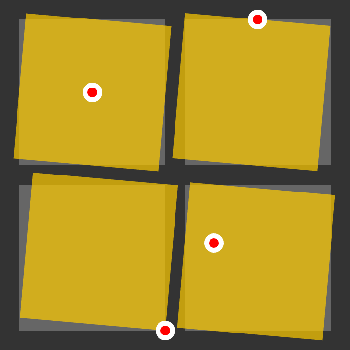
There’s one important aspect missing. If you are transforming a box, there is a further parameter involved: the origin of the transformation. If you are rotating, for example, it will, by default, turn on the point that is the center of the box; if you had a piece of card, stuck a pin right through the middle of it, and then stuck that to your forehead (don’t do this), the card would spin from the middle. You can change where in the card the pin is stuck with transform-origin, however:
transform-origin: 0 0;
This example will tell the box to transform (rotate, in the previous example) from the top left, the first “0” being horizontal, the second being vertical. These values could be different, of course — like all other x-y, and you can use the usual center, top, right, bottom, left, length and percentage values, including negatives.

