
CSS Property: transform-origin
The point at which transformations are measured from.
Works hand-in-hand with the transform property.
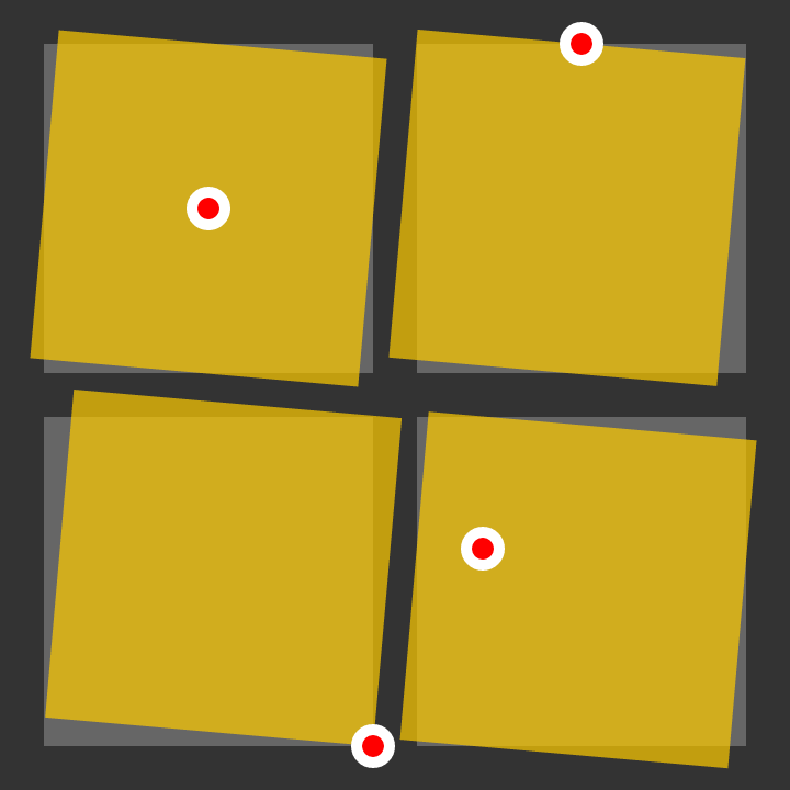
Possible Values
| Value | Description | Example |
|---|---|---|
| [length] | The horizontal distance from the left of the bounding box. Vertically centered. | 100px |
| [percentage] | The horizontal distance from the left of the bounding box, the percentage taken as that of the width of the bouncing box. Vertically centered. | 25% |
center | Horizontally and vertically centered. | |
top | Top edge of the bounding box. Horizontally centered. | |
right | Right edge of the bounding box. Vertically centered. | |
bottom | Bottom edge of the bounding box. Horizontally centered. | |
left | Left edge of the bounding box. Vertically centered. | |
| [value] [value] | Unless keywords are used (such as top right, the first value is the horizontal distance from the left edge and the second value is the vertical distance from the top edge of the bounding box. | 100px 25% |
| [value] [value] [length] | For 3D transforms. As [value] [value], with the additional length value used to define a position on the z-axis. | 50px bottom 25px |
inherit | ||
initial | ||
unset | ||
Example
#pool {
    transform-origin: top;
    transform: rotate(10deg);
}
/* Rotates the box 10 degrees clockwise around the top-center point. */

#loch {
    transform-origin: -20px -40px;
    transform: rotate(-20deg);
}
/* Rotates the box 20 degrees counter-clockwise around a point 40px above and 20px to the left of the top-left corner. */